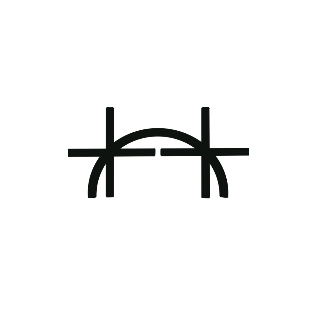
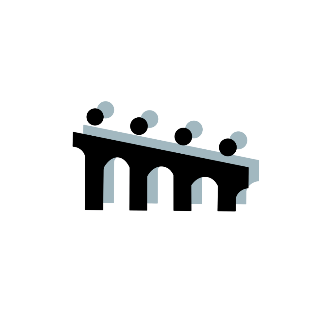
These are drafts from a rebrand project for Doty Island Community Partners. While none of these were ultimately selected, they remain designs I love. Growing up in Neenah, WI, one of the communities served by this organization, made this project especially meaningful. I enjoyed drawing inspiration from my roots, incorporating bridge motifs to reflect Doty Island’s accessibility via its many bridges. It was a playful and creative process, designing elements like people resembling bridges to symbolize connection and community through shape and form. I also explored color palettes inspired by local photos and the distinct colors of Neenah and Menasha, the two cities that make up Doty Island.